Widget Navigation
Widgets have a common set of navigation elements available. Not every widget has all of the elements, for instance, if a widget is not directly updatable, it will not have the update icon in the widget frame.

Standard widget navigation is located in the top bar as part of the widget frame.
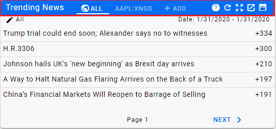
The top bar begins on the left, with the name of the widget. In this case, Trending News.

Following the name is the Widget Tab area.
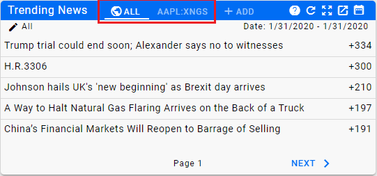
Widget Tabs are used when more than one set of results can be displayed within the widget. The actual content for each tab is determined by the type of Widget being utilized.
Next, if it is enabled, will be the searcher tab.
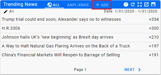
The Searcher is used for widgets that are set up to allow you to add additional result sets to the widget. When you click on the searcher tab, a search bar will open up to allow you to look up an Entity to add to the widget. Currently, this does not permanently add the entity so if you navigate away from the page showing the widget, you will lose the additional tab.
Next is the widget action area.
![]()
| Icon | Action |
|---|---|
| Help for the widget | |
| Update the widget | |
| Expand the widget to a full screen | |
| Pop the widget out in a new window | |
| Access the Widget Date Filter |
Below the action area in the upper left is the Widget Filter for those widgets who use one.
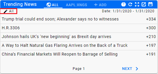
Clicking on the filter will open up the Widget Editor, allowing you to change the filter settings for the widget.
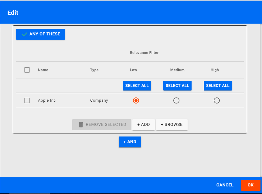
Within the Widget Filter Editor you can change the filter settings to get a more precise result. It behaves in exactly the same manner as the Channel Editor. Note that the results are not saved permanently so the next time you view the page containing the widget it well revert to the original settings.
The Widget Date Filter can be used to quickly modify the date range for the widget.
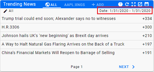
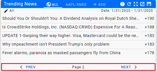
If the widget includes paging, the ability to move to the next or previous page is located at the bottom of the widget.
Home PowerIntell.AI™ Apollo Pro® RegLens®